
Do you know the story of calorie density? Let’s back up – what is calorie density anyway? Calorie density (CD for short) is the number of calories in a given weight of food, say one pound. The more calories in that pound of food, the more calorie “dense” it is. Recently, Jeff Novick published a table of 73 common plant foods and their associated calorie densities. The table itself was pretty dense and a little hard for me to digest as a big wall of numbers. I thought you might find the CD numbers (and concept) to be more human-friendly in a graphical form.
Food Items – The Trees
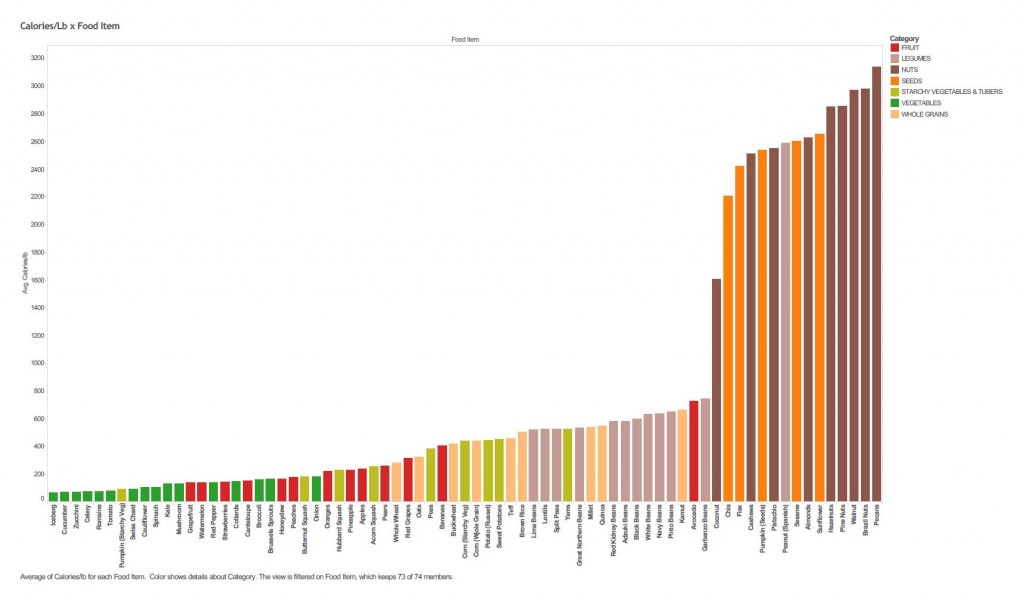
Figure 1 – Calorie Density for Common Plant Foods. Click the image for a PDF/enlarged view
It’s great if you can see all of the data in a single view – that’s Figure 1. (Be sure to click on the Figure to get the expanded version). In the view, each bar is a different food item, and it’s labeled with its common name. The bar height represents the calorie density of the food. The color of the bar indicates the category, or food group, of the item – such as fruit, whole grain, or nut. I attempted to make the colors memorable: vegetables are green (like spinach), fruits are red (like an apple), whole grains are tan (like bread), etc. Finally, the foods are sorted left to right, starting with the lowest CD foods on the left, progressing to the highest CD foods on the right.
What big features do you see? Go ahead and look – I’ll wait. Do you notice lots of green and red (veggies and fruits) on the left, and lots of orange and brown (seeds and nuts) on the right? The middle is populated with a mixture of starchy vegetables, whole grains, and legumes. Perhaps most prominent of all, though, is the steep cliff as you approach the nuts and seeds. The nuts and seeds aren’t just a little more calorie dense than foods to their left – they’re a LOT more calorie dense.
Do you also observe some small, but interesting, details? For instance, the peanut is a lone legume situated in the rarified calorie dense air of the seeds and nuts. The avocado is a high CD fruit compared to its brethren. And the friendly pumpkin is a low CD starchy veg that’s more akin to a green vegetable.
Food Categories – The Forest
Above, we used the food categories, or groups, to color the chart. But you can also use them to condense the 73 food items into 7 numbers, one for each category, as shown in Figure 2. Here, each bar is a different category (vegetable, fruit, legume, etc.). The bar height indicates the typical CD of the foods belonging to that category. [Technical Note: For the typical CD value, we used the median of the category. The median is a good, representative value, and it isn’t skewed by unusual, outlying items – like avocados or peanuts – the way an average value is]. The colors of the bars and their sorting are the same as used in Figure 1 for the individual food items.
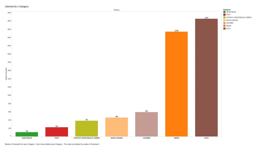
Figure 2 – Median Calorie Density for Common Plant Foods Categories. Click the image for a PDF/enlarged view
Hopefully, this view clarifies the big picture which may not be readily apparent from Figure 1. It’s looking at the forest instead of the trees. Perhaps this view reminds you of the visible spectrum of light that you learned in a science class – and the acronym, ROY-G-BIV, for the colors in the spectrum. For calorie density, we have the rather unwieldy VFSWLSN. (If you come up with a mnemonic, rhyme, song or other memory device for the CD spectrum, please leave a comment or send me an email. My best effort to date is “Venture Far and Stay WelL, SoN”. I’m really hoping you’ll do much better).
What’s the Story and Why Do We Care?
Data, and even friendly graphics, become really useful when translated into a descriptive statement or story – or better yet, a prescription for action. What do the calorie density charts tell you? My reading is, “Adjust your fuel mix for different goals.” (Remember, calories are a measure of the energy content in food). For instance:
- If your goal is weight loss, consider eating more low-CD foods (fruits and veggies) and fewer high-CD foods (nuts and seeds).
- If you are new to the diet, eating “plant strong” does not mean eating just salads composed of foods at the low end of the CD spectrum. By eating your typical daily amount from strictly low-CD foods, you won’t get enough calories. Then, you feel weak-and-shaky, or fatigued, or not full enough[1]. [Estimates vary for the daily amount of food that the average person eats, but it’s somewhere between 3 and 5 pounds. Your mileage may vary. But the important point is that you do consistently eat the about the same weight of food each day].
Finally, whenever you look at information of this type, remember this: food data provides guidance, not a prescription for precision diet engineering. There can be pretty wide variance in these numbers for a lot of reasons, so use them for direction, not for high-powered math.
[1] This is my own personal theory about what happens to some people who try to eat plant strong/vegan, but give up, citing that they feel tired and not full enough. They often tell me they weren’t getting enough protein, but I think they just weren’t getting enough calories.
 (4 votes, average: 5.00 out of 5)